Sonic the Hedgehog is a live-action adventure feature based on the global videogame franchise from Sega. The film centers on the brash, bright blue hedgehog with incredible speed, and it came to the cinema after a fan induced, major reworking of the central character and his animation. We spoke to VFX supervisor Ged Wright about the re-design and subsequent box office success of the film’s delayed-release.
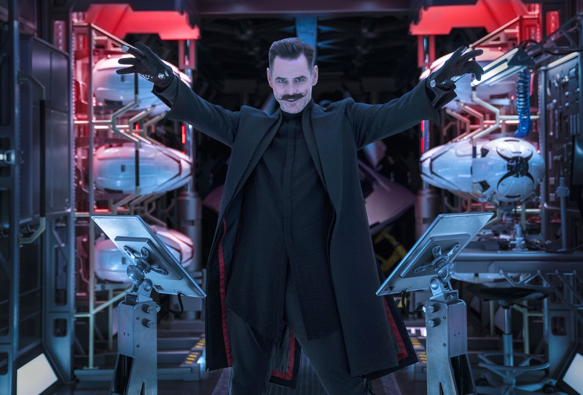
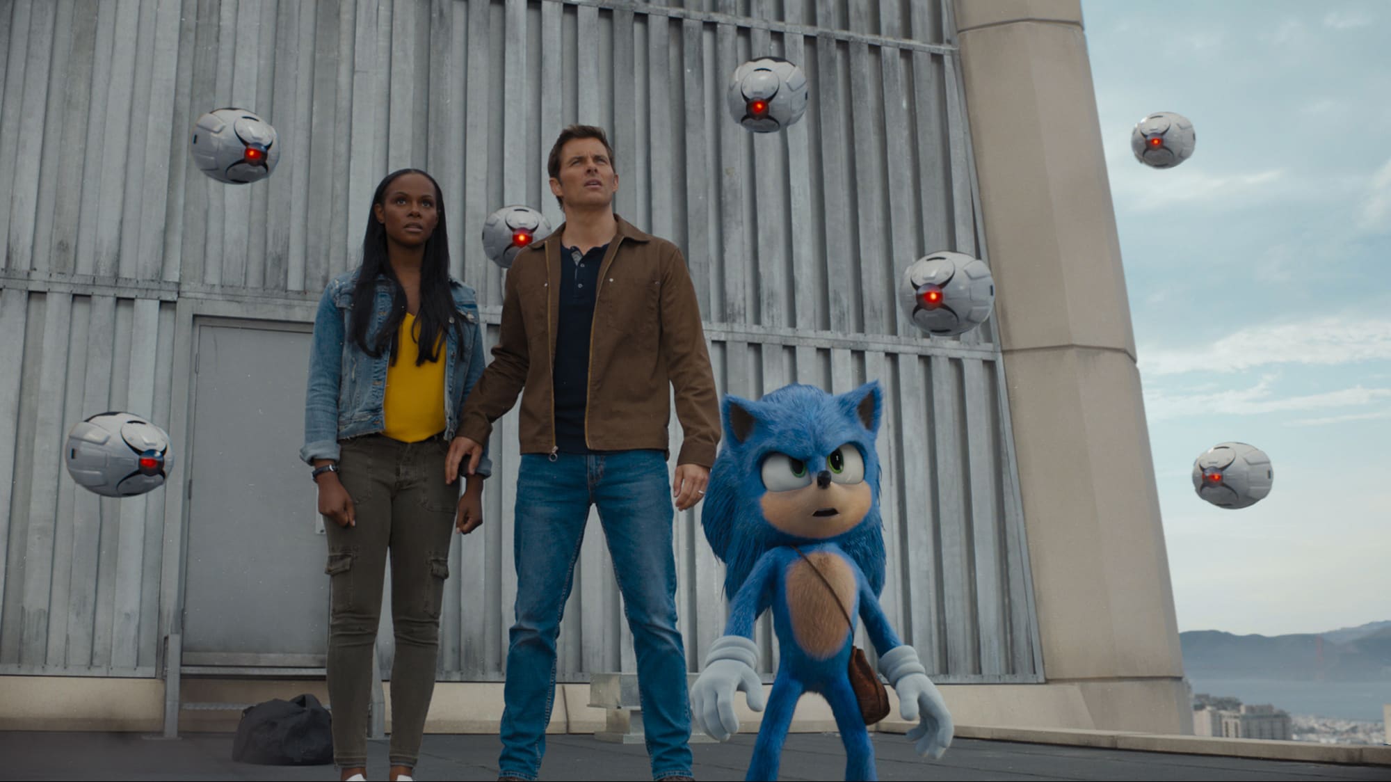
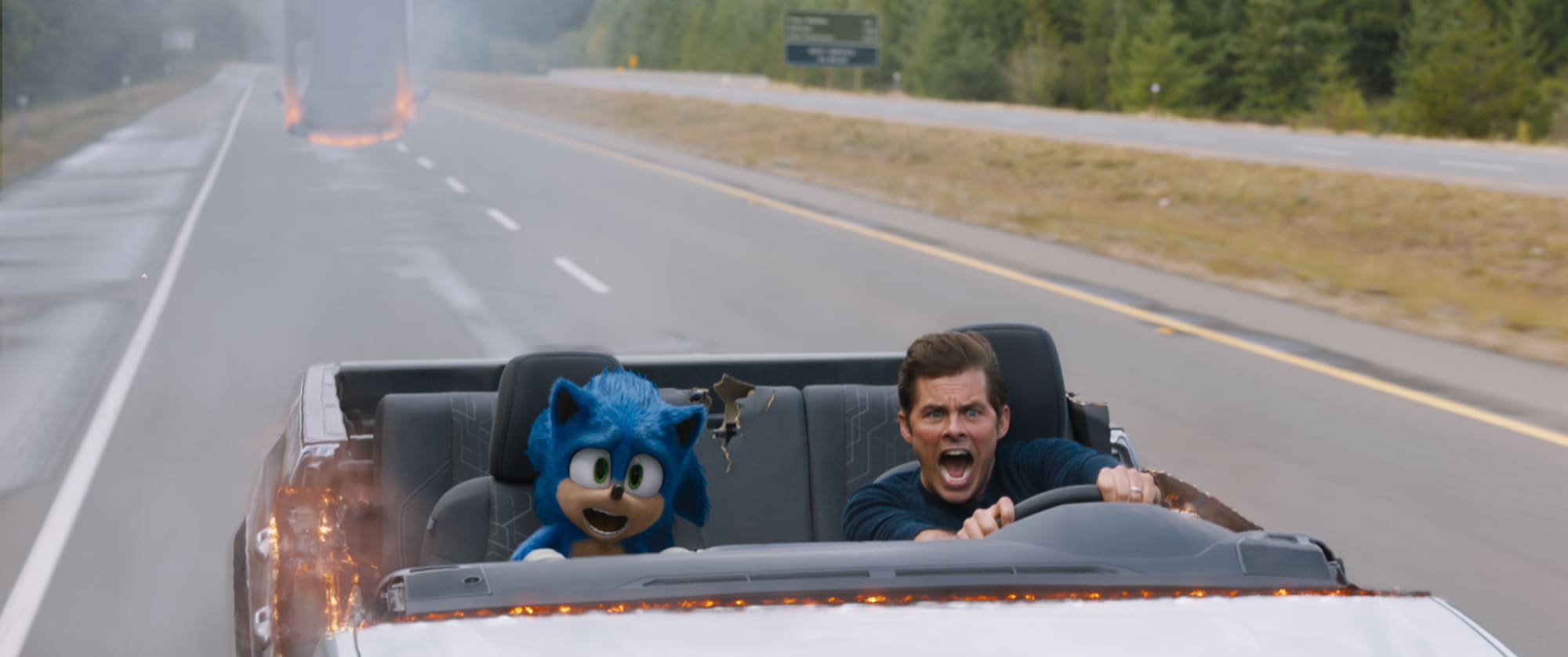
The film follows the adventures of Sonic as he navigates the complexities of life on Earth with his newfound human best friend, a small-town police officer, Tom Wachowski, played by James Marsden. The film also features the villainous Dr. Robotnik, played in classic comic form by Jim Carrey, with Ben Schwartz as the voice of Sonic.
Jeff Fowler took a sabbatical from Blur Studios to direct the film, which was also had Blur’s Tim Miller (Deadpool, Terminator: Dark Fate) as Executive Producer. Miller and Fowler were nominated for the Academy Award for Best Animated Short Film in 2004 for their short film Gopher Broke.
The visual effects supervisor was Oscar-nominated Ged Wright. He already has an impressive list of credits, including multiple Harry Potter films, Man of Steel (2013) and Iron Man 2 (2010) to name a few. For Sonic the Hedgehog, MPC did the primary animation/effects work.
The first trailer of the film caused a massive fan backlash. On May 2, 2019, director Jeff Fowler announced on Twitter that Sonic’s design was going to be altered from the initial more ‘real-world look’, (originally designed to integrate the character better with the real-world setting) to make the character “the best he can be.” The movie’s scheduled release moved from Thanksgiving weekend 2019 to Valentine’s Day 2020. When a new trailer and poster were released on November 12, 2019, fans praised Sonic’s new look and the film went on to have a very strong opening at the cinema.
Wright points out the interesting thing about the project for him was that “in essence, it was conceived as a live-action film, but Sonic is in the film all the time. So while you have a photographic background, we were actually making an animated film.” Regardless of the redesign, translating a primarily 2D character to 3D is very difficult. The artist that draws or poses a 2D representation avoids awkward angles, such as directly front on, by rarely if ever showing that angle of the character’s face. The team also had to integrate the character into live-action lighting faithfully while also maintaining Sonic’s very distinctive and saturated colours.
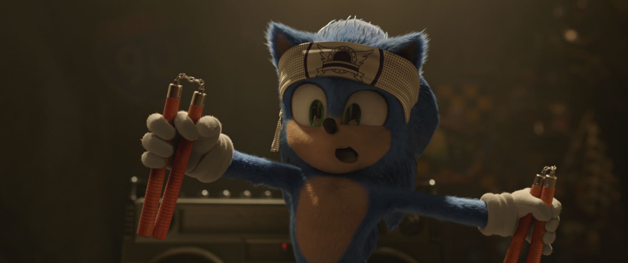
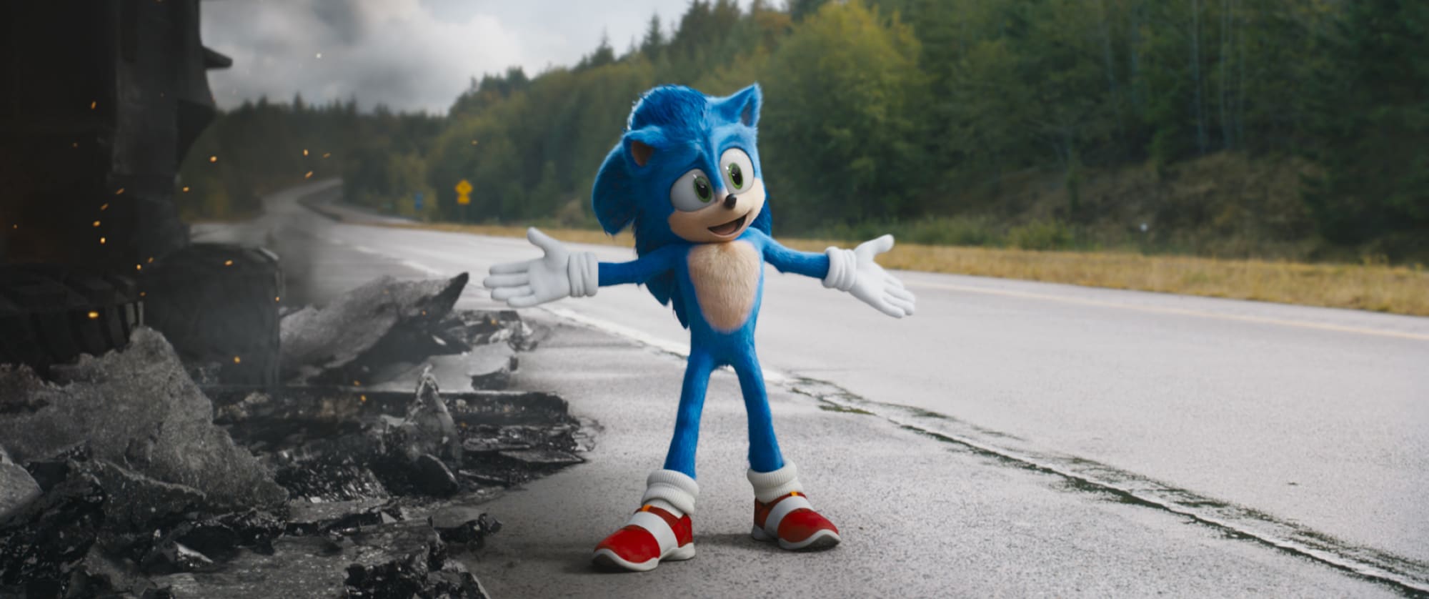
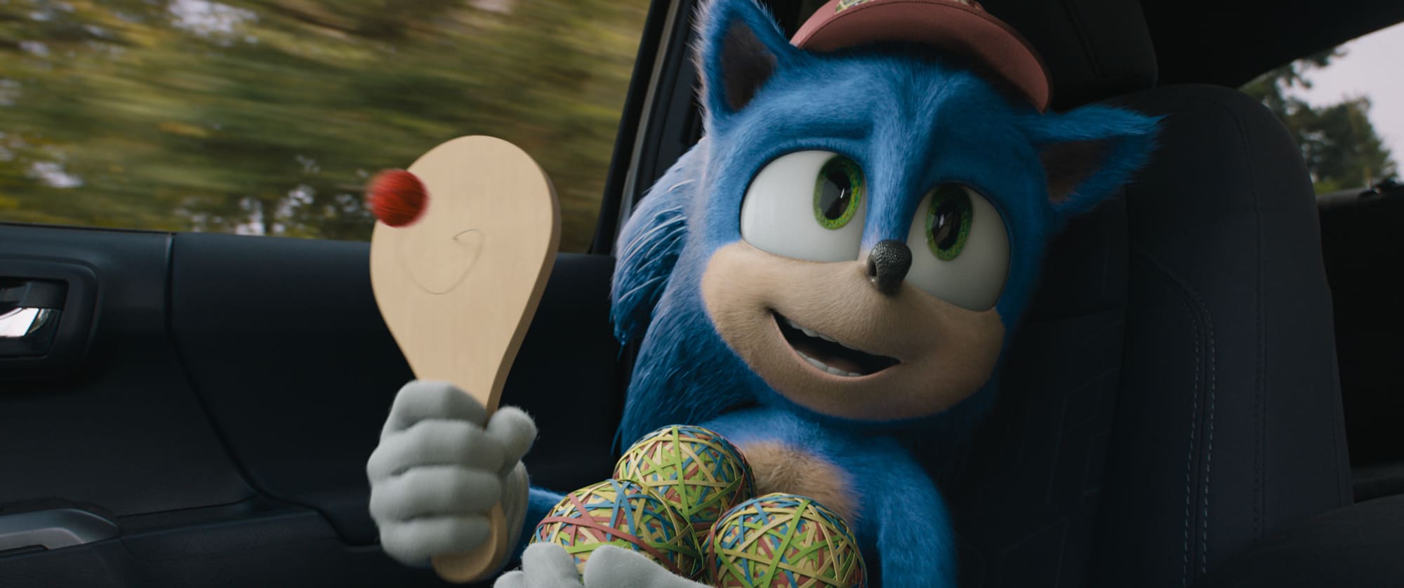
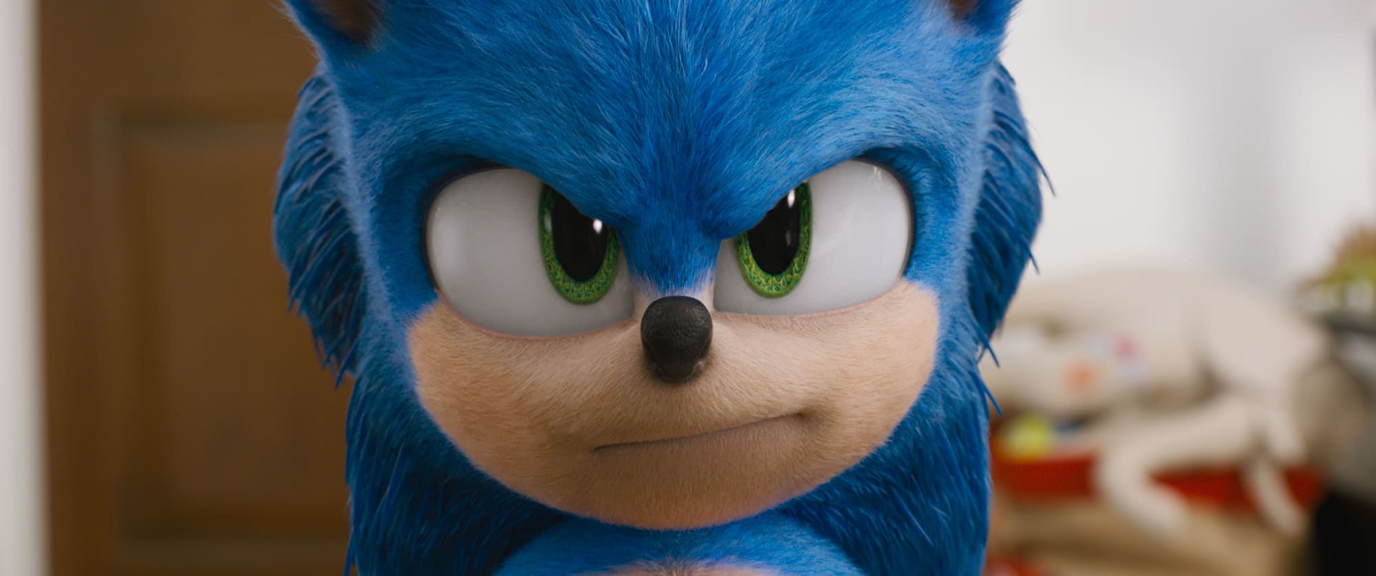
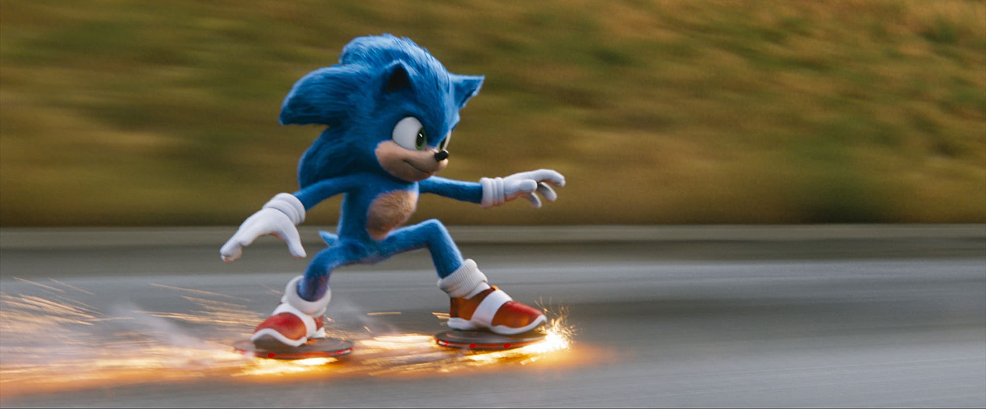
For the redesign, Sonic was given larger and different colored eyes, new running sneakers which resemble the original Sonic sneakers from the games ( but labeled with a Puma logo), white gloves (vs white hands), and a less humanlike body in order to resemble the character’s design in the video games. His mouth and teeth were also extensively altered. It is estimated by IMDB that the delay of the film and the stylized redesign of Sonic put the film $5,000,000 over its original budget of $90 million, making a final budget of $95M.
When the redesign was commissioned, Artist Tyson Hesse, who had worked on previous Sonic the Hedgehog media, was brought on to lead the redesign. “But a lot of the work that the team had already done as far as the look of Sonic’s fur, should he have eyelashes and what they look like…how we should handle the eyes…all that kind of stuff was actually directly translatable over to the new design,” comments Wright. “I think the redesign took only seven or eight weeks, which is a record at MPC for the design of a 3D character.”
The process was helped by Hesse having a strong relationship with Sega previously. The team flew to London, “where we all sat with the guy that was concept sculpting and literally just did it in real-time.” Wright felt that because there was a clear remit for Hesse to take the redesign lead, it allowed everything to fall into place very simply. “Actually, funnily enough, the redesign was pretty painless. In some respects, a more exaggerated character is a simpler thing for the team to execute,” he comments.
MPC and the team were careful to try and keep limb lengths the same, so while some of the characters’ proportions are different, the original blocking and framing of the shots was able to be used. Of course, the character’s face and final renders all changed, but at that stage, the team had not finalled many shots.
The production had a small internal production team that undertook a large post-viz effort on the whole film. The pre-viz team using a rough version of Sonic blocked out the whole movie. It used full 3D tracking and was properly rationalized so that we could take that data and just push it through the production pipeline directly to MPC” Wright points out.”Looking back, the storytelling problems and the narrative structure of the film that had been built with that older version of Sonic was still applicable when the design changed.”
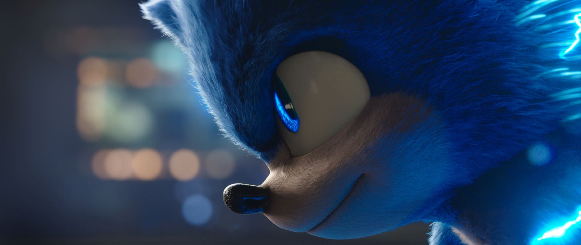
The new Sonic was much more of a Pixar or Disney style character. In addition to the changes mentioned above, the new character no longer has round eyeballs and his eyebrows are more defined. “A huge amount of the care in animation came down to his eye positions because we didn’t want him to look cross-eyed,” Wright explained. “But with the new two oval eyes and his traditionally drawn style of having the pupils drawn really close together, we had to work to find key positions where he definitely looked like Sonic.”
His eyebrows and other aspects of his face are also no longer evenly coloured. This was informed, Wright explains, by work that they had done previously. “Clearly one needed to add some color zoning to accentuate the structure of his face with underlying color variants. As opposed to just having his fur be one single flat blue.” Without the regional colour shifts, Sonic’s expressions did not stand out and with them, Wright found it easier to help reinforce where the audience’s eyes should be led to on the character’s face. “I think there was just an assumption that Sonic would be one blue tone, but it just doesn’t work.” These colour emphasises are very visible in many of the character’s traditional 2D artwork. Sonic’s new hands, while larger and now in gloves, actual change size from shot to shot, to match a visual consistency to the new more stylized look.
In addition to the issues of budget or schedule, there was a managerial aspect Wright faced in not having his team lose heart over the redesign. “Jeff (Fowler) was kind enough to come up to Vancouver along with people from Paramount and he gave a really lovely speech to the whole crew,” he recalled. Wright stood next to the Director as he spoke to the MPC team, “and I could see that it meant a lot to them. That the person that’s making this film came, rather than sending an arbitrary edict from LA. Instead, he had come and was thanking them for their energy,” he adds. “Jeff was excited by the opportunity and expressed that to them. He also had time, to sit one-on-one with various artists. Jeff definitely took the time to recognize that people had invested a lot of their personal lives in this and that you need to say thank you.”
After that meeting, the team picked five test shots, on being Sonic sitting on a motel bed, talking about how he doesn’t want to leave. “And one of the very first takes of that shot that came back from the animation was just absolutely perfect” Wright recalls happily. “We took a very exaggerated design that you could see was going to work when he was running around and dodging explosions and after the Director’s little pep talk, the team had come up with a very heartfelt and expressive performance with this new very exaggerated character. I think what’s ended up in the final movie, bar some tiny tweaks, is pretty much exactly that test”.
That test was particularly significant as the primary concern, in the redesign, was that the character could be expressive and deliver a performance. The team were not concerned about the action sequences but for a feature-length film to resonate with audiences, Sonic would need to do much more than just be a blur on the screen or fly around in the film’s inevitable action sequences. “We needed more emotional variation and subtlety to Sonic, and the animators delivered that,” Wright adds. “I think one of the concerns with going with such an exaggerated design is that it wouldn’t be capable of doing that. And I think that seeing that animation test come back so strongly brought everyone’s heads up and gave them their energy or perhaps the confidence to move forward.”
Courtesy & Credit : MIKE SEYMOUR